 The Crested Butte News Serving the Gunnison Valley since 1999

But receives pushback from CBMR
[ By Kendra Walker ]
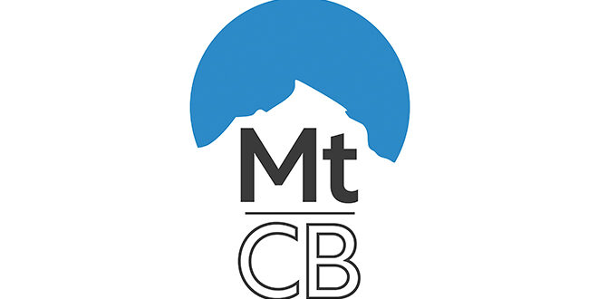
Mt. Crested Butte has a new and improved logo, which was approved by the town council during their May 3 meeting. However, the logo design first brought a lengthy debate before being approved due to Crested Butte Mountain Resort’s concerns over the logo’s similar use of the Mount Crested Butte peak silhouette.
Members of the town council, planning commission and downtown development authority (DDA) worked with a consultant on the new design as part of their plans to install new wayfinding signs around the base area this summer. The original logo design that received overwhelming approval by the group included the mountain silhouette with a bluebird sky and a yellow sun rising behind it. CBMR vice president and general manager Tara Schoedinger, who is also a DDA member, voiced concerns that the image was too similar to the ski area’s current logo and that people would mistake the two.
“The CBMR logo is a federally registered trademark for the resort. It has been in use by the resort since at least as early as 2013 with the silhouette of the mountain and the sun located to the right of the mountain peak,” Schoedinger said in her feedback last month.
“The Town’s proposed logo, with the silhouette of the mountain and sun located to the right of the mountain peak, as well as the style of font, are nearly identical to the Resort’s logo. The visual similarities between the Town’s proposed logo and the Resort’s logo will confuse people and could have people mistakenly believe that there is a connection between the Town and the Resort and the services provided by each. If there are issues with the services provided by the Resort it could negatively impact the reputation and brand of the Town and vice versa. It is in both entities’ interest to have separate and distinct logos to represent our individual brands and the services provided.”
She continued, “Speaking as a member of the DDA, one option that would be interesting to see could be to modernize the Town’s existing logo, that already has a different silhouette of the mountain, with updated fonts and colors.”
During their April 19 meeting, the council took Schoedinger’s concerns into consideration and asked the consultant to make some adjustments to the logo. On May 3, the council agreed a design without the yellow sun in the background would be a good compromise.
However, Schoedinger reiterated her concerns to the council. “As the operator of the resort and a business within your municipality…I respectfully ask the council to not vote on the logo tonight and instead direct the consultant to develop other options that are not visually similar.”
“The list of everybody using the peak and a sun in the valley is outrageous,” said council member Steve Morris. “For me this is less a legal issue and it’s more about finding a more reasonable middle ground with a major partner in the community.”
“I feel like the logo without the sun is enough different and the lettering is enough different to me to feel comfortable that they’re not going to be confused,” said council member Janet Farmer.
“When this came up my initial thought was how could anyone confuse CBMR’s logo with this, simply because CBMR’s logo is rectangular and this is round,” said council member Dwayne Lehnertz. “So I have a hard time connecting with the logic that they could somehow be confused. I understand your concern, I just have a hard time imagining that it could be confused, especially removing the sun.”
“What if we look at this from a different point of view and we were established 60-plus years ago and this was already our logo. And CBMR came up and said, we’re going to create a logo by sticking a sun behind the peak…Would we think that would be similar to ours? I think so,” said council member Michael Bacani.
“It wouldn’t bother me though,” said Farmer.
“They wouldn’t ask us permission either,” said town clerk Tiffany O’Connell.
“We have two elements that are used by literally everybody in the valley. Is the corporation addressing legal concerns with the other 25 entities?” said Morris.
“I’m not speaking to you as a lawyer, but as a DDA member,” said Schoedinger. “If the town were willing to consider more than basically two options, I would certainly be more willing to collaborate and connect with our legal team. I can’t speak from the legal perspective but my ask is that we have two distinct brands. I’m happy to work with the town on that if the town were to consider more options beyond the two.”
“So, we get six more options and we still decide this is the option we like the most, then where are we?” asked Lehnertz. “The bottom line is that we could end up at exactly the same place granting your request, so then where will we be.”
“I don’t know that I can predict the future,” said Schoedinger.
Mayor Nicholas Kempin chimed in. “The mountain is used by everybody around here. If removal of the silhouette of the mountain is the dealbreaker, I think that’s going to be tough. I’m not sure how we’re going to come up with a logo that doesn’t incorporate Mt. Crested Butte. We took some of that input and made some changes to what’s being presented as we see here tonight. Do we want to take action on this one tonight?” he asked the council.
“I come to you all as a business member of your community, asking that between the municipality and the largest business within your municipality that they have separate and distinct brands. And that has been my ask all along,” said Schoedinger. “I am happy to work with you guys and I do believe that we can get to a resolution on this.”
Lehnertz made a motion to accept the logo design of the mountain silhouette in front of a blue sky without the sun in the background, and the council voted unanimously in favor.
“I appreciate the sentiment, I appreciate you guys considering my feedback,” said Schoedinger. She also stated at the beginning of the discussion, “I appreciate the efforts that everyone has made to begin to improve the relationship between the town and CBMR. You all know how incredibly important the relationship between the town and resort is for me, and I also believe it’s an important relationship for our community.”
The town plans to incorporate the new logo into its new wayfinding signage around the base area this summer.